This guest post was written by Payton Jones (payton_jones@g.harvard.edu), and is the abbreviated version of a tutorial published in Frontiers recently (“Visualizing Psychological Networks: A Tutorial in R“). Payton is a graduate student at Harvard University in the Richard J. McNally lab. His research focuses on the etiology of mental disorders and statistical methods.
Network analysis is an exploding field! I absolutely love seeing the constant flow of new papers and new researchers using network methods.
With such a quickly growing science, it’s difficult to keep up! Although I have personally found the network community to be very welcoming, friendly, open, and accessible, that doesn’t negate the fact that there is just a lot of information to keep up with.
As I work to keep up and learn new information, I’ve become aware of some mistakes I made early on. This tutorial is intended to keep you from making the same mistakes that I did.
The Big Four: How NOT to Interpret Networks
At this point, I’ve seen at least a few dozen symposium presentations on network analysis, many of them from researchers just starting out with network analysis. Here are some of the most frequent errors:
Error #1: Nodes in the center are central
“The somatic symptoms of depression were out on the periphery, barely part of the network”
“Extraversion is right in the middle of the personality network”
This misinterpretation pops up all the time. I blame linguistics.
In reality, there are several different types of node centrality, and none of them necessarily correspond to network plots. You have your centrality values and centrality plots—use those instead of looking at the network plot. Eiko wrote about this and similar centrality interpretation problems in a recent blog post.
Error #2: Nodes close together are similar, nodes far apart are not
“As you can see, sad mood and agitation were on opposite ends of the network”
“Surprisingly, weight gain and weight loss were right next to each other”
Again, not so. A good way to reality check is to look at the edges: if node distance corresponds perfectly to node similarity, all edges of a certain thickness should have exactly the same length, and all edges of the same length should have the same thickness (hint: that’s rarely if ever true).
Error #3: Left, right, up, and down mean something
“Intrusive thoughts were far to the right, close to the depression cluster”
This one is rarer but pops up occasionally. I see people make this error especially when there are meaningful clusters. Resist temptation; if you want to know if a node is “close to the depression cluster”, use bridge centrality instead.
Error #4: A different looking network means a different network structure
“As you can see from the plots, the networks did not replicate well, indicating that edges in network analyses are mostly comprised of measurement error”
*Cough*. Relating to Error #3, in most network plots rotation is totally arbitrary (the enemy’s gate is down!). In addition, certain types of network plots (e.g., force-directed) are very unstable even with similar networks. This can wreak some serious havoc when trying to interpret multiple networks.
In my experience it’s much more informative to use a correlational approach (e.g., do the edges correlate? does centrality correlate?) to judge replicability (Eiko discussed these and similar metrics in the section “A word of caution” in this blog post). For plotting, it’s best to either use an consistent averaged layout for both plots or the Procrustes method (see Figure 6 in the full tutorial).
How Do We Fix It?
One way to fix the interpretation problem is to stop making any visual interpretation! Certainly, we shouldn’t pretend we understand 20-dimensional causal information just because we made a 2-dimensional plot of partial correlations (!).
But the whole point of a visualization is to help us understand our data better. And although we should stick to the numbers for our research conclusions, there is something to be said for exploratory hypothesis generation that comes from good visualizations (as long as you don’t pretend that these hypotheses were confirmatory all along).
So our second option is to try and do the best we can to make accurate visualizations, while simultaneously reigning ourselves in with visual interpretations. Here is a super quick overview of some of the options.
Visualizing Your Network
This is a short version of the open-access tutorial. You’ll need the qgraph and networktools packages for the code to work, and we’ll get some data from package MPsychoR. First some code for getting a network:
library(qgraph)

library(networktools)

library(MPsychoR)

data(Rogers)

mynetwork <- EBICglasso(cor_auto(Rogers), nrow(Rogers))
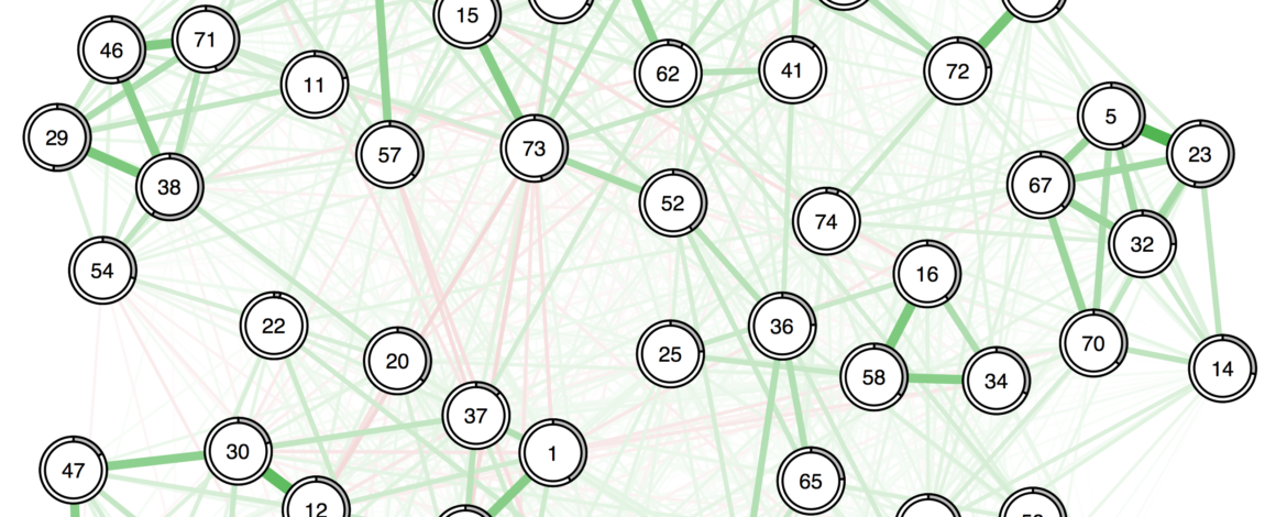
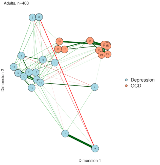
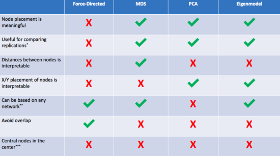
1. Force-directed algorithms (AKA the way you've been doing it already)
myqgraph <- qgraph(mynetwork, layout="spring")
Most networks you see "in the wild" are plotted with the Fruchterman-Reingold algorithm. This algorithm works by treating each network edge is like a spring—it pulls when connected nodes get to far away and pushes when they get too close.
This creates really nice-looking networks in which nodes never overlap, and edges are mostly about the same length (the "resting state" for the spring forces). In very sparse networks, it can be a good way to visualize clusters. But all of the Big Four are dangerous here.
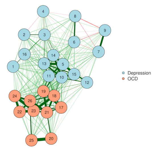
2. Multidimensional scaling (MDS)
MDSnet(myqgraph, MDSadj=mynetwork)
Multidimensional scaling solves our Error #2—distances between nodes actually become interpretable in an MDS plot. In other words, the algorithm works so that nodes placed close together usually share a strong relationship, and nodes far apart do not. This is, of course, accounting for the fact that we've squashed everything down into just two dimensions—so stay careful with interpretations!
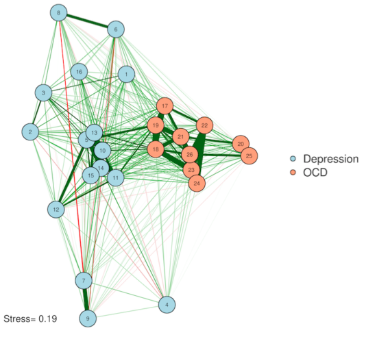
3. Principal components analysis (PCA)
PCAnet(myqgraph, cormat=cor_auto(Rogers))
You've probably heard of PCA—but for plotting a network? PCA is a simplification method—it tries to squash all of your complex data down into just a few variables. This is perfect for us, because our plots have only two (count 'em) dimensions! The idea here is that we give each node a score on Component #1 and on Component #2, and then use these scores to plot on an X/Y axis (this solves Error #3). We preserve complexity in the form of network edges but make the plot as simple as two principal components. If you're feeling adventurous, you could even come up with labels for what the dimensions might mean.
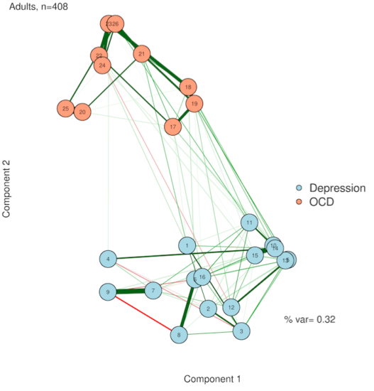
4. Eigenmodels
EIGENnet(myqgraph)
If you liked PCA, you're in for a treat with eigenmodels. PCA is great, but it requires that you either have the original data or a correlation matrix from that original data. In other words, PCA isn't really based on your network per se, it's just based on the same data that generated the network. Thankfully, someone[https://www.stat.washington.edu/~pdhoff/code.php] came up with a way to extract latent variables from symmetric relational data (AKA undirected network data). The interpretation is similar to PCA plotting, but everything comes straight from the network itself.
And that's it!
If you liked the abbreviated version, you can check out the full tutorial for a deeper look at the same concepts and some more sophisticated code. Happy visualizations!
Citation:
Jones, P. J., Mair, P., & McNally, R. (2018). Visualizing Psychological Networks: A Tutorial in R. Frontiers in Psychology, 9, 1742. https://doi.org/10.3389/fpsyg.2018.01742
Pingback: Looking back at 2018 - Eiko Fried
Pingback: Summary of my academic 2018 - Eiko Fried
Pingback: Updates in networktools 1.2.1
Pingback: Tutorial: how to review psychopathology network papers | Psych Networks
Pingback: Updates in networktools 1.2.1 ⋆ Best Anxiety Treatment Guide